
My Work
RECENT WORK
ILLUSTRATION & MOTION
TYPOGRAPHY STUFF
RENDERS/3D
Recent Work
MUSIC IS SOUND
Pasta Font
Form font
Strakers
Case Studies
Pasta Font
Random Font
Clay Typeface
Other Typeface
Milkman
Strakers
Mental Mind Magazine
Miixt
Fonts
BROWSE MY FONT SHOP


Features:
Its Nice That Artical
︎

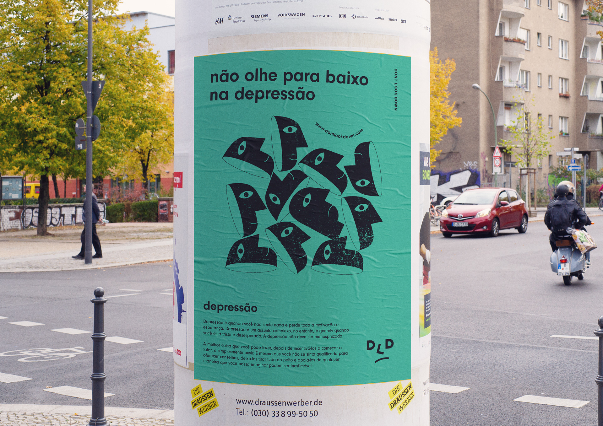
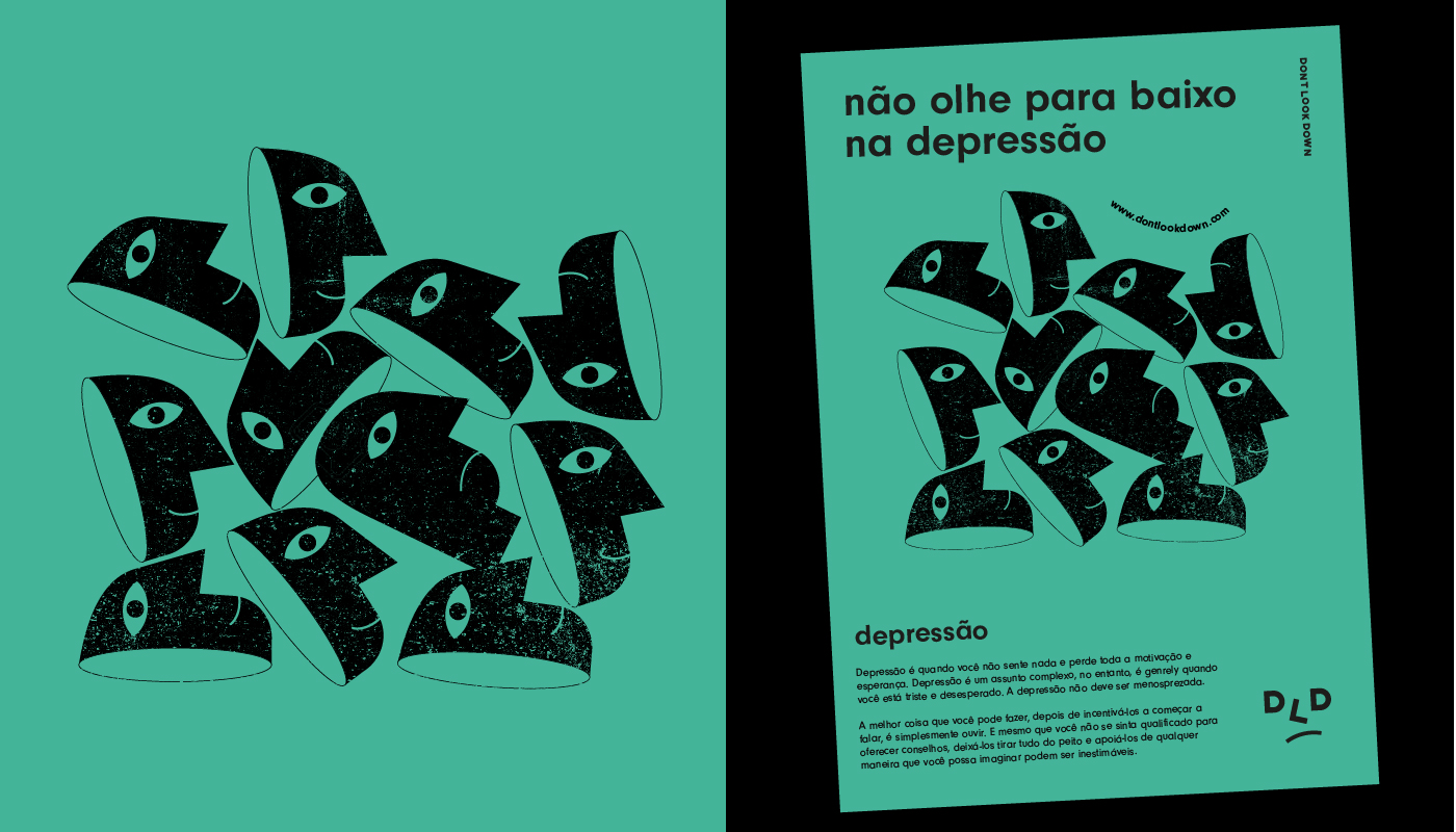
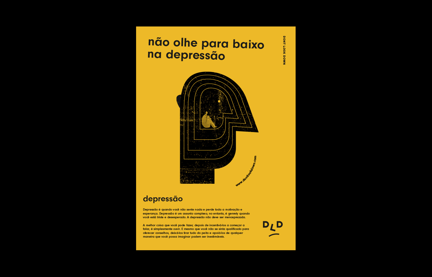
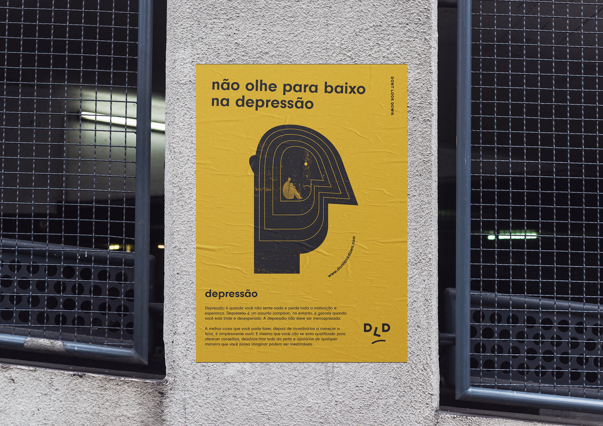
Dont Look Down
CAMPAIGN / BRANDING / POSTER DESIGN
Don't look down is a mental health awareness brand. This campaign is in brazil. Unlike a lot of mental health campaigns, DLD targets people that are unaware of the importance of mental health and what people go through who have it. This campaign is called don't look down because we want to remove the stigma around mental health.


topic with a lot of people not coming out with it in fear of being looked down on. This is a big reason why people don't get treatment for their mental health issue because of the stigma by family members, friends and society.
The problem
The problem
The stigma around mental health is a big reason why people don’t get help. This needs to change. I need to change their views and attitude towards mental health. By changing the attitude towards it this will create a domino effect of more people opening up as a result of increased social and cultural sympathetic views on mental health.
Social change = more people opening-up
My solution
My solution to this problem is to communicate how mental health affects people and educate them on the symptoms. I want to focus on the idea that people with mental illnesses are not “loco” (crazy). I want to reach out to the victims as well as the general public who don't suffer from the illness because they are likely to unknowingly know someone who suffers from mental illness.
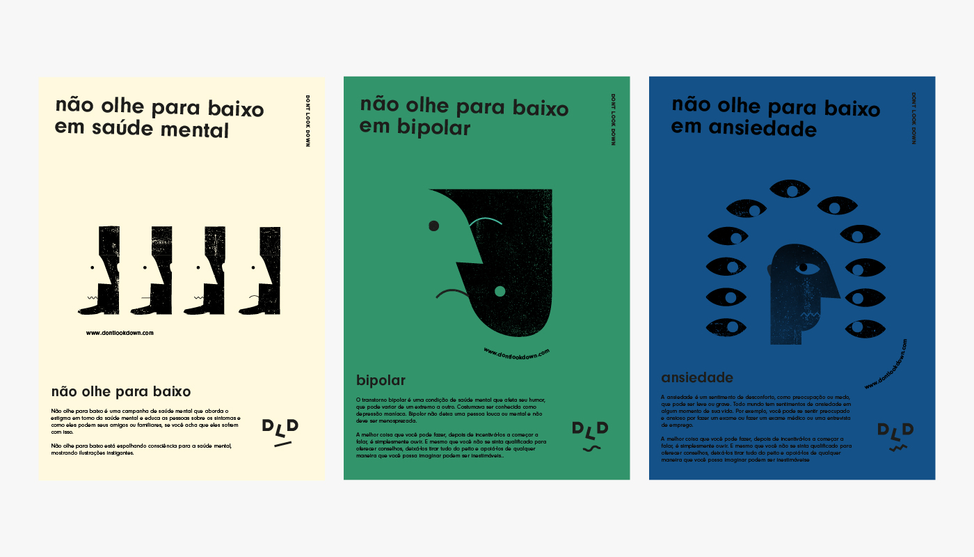
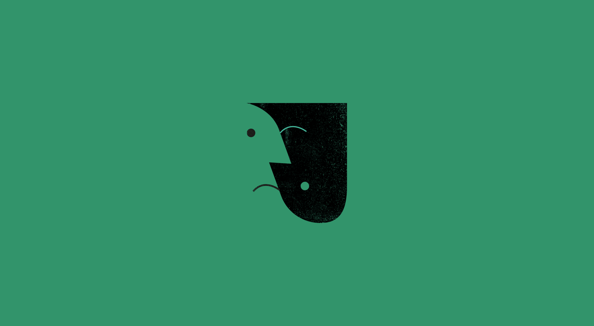
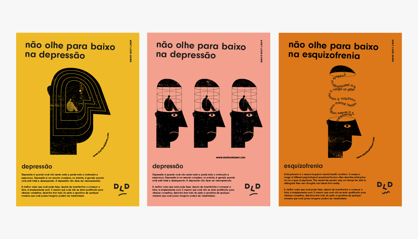
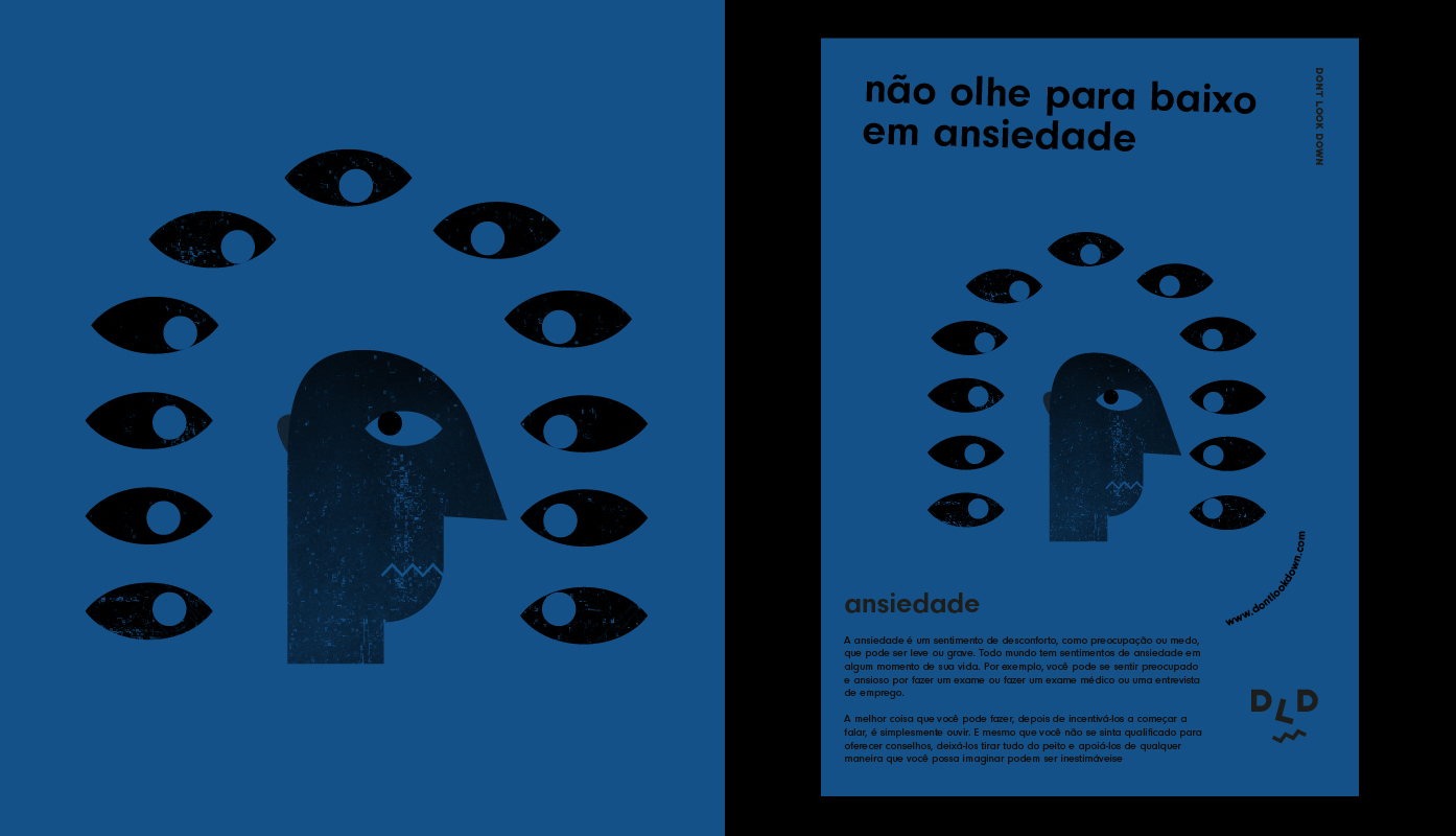
I went with bold and eye-catching colours inspired by Brazilian street art and shanty townhouse colours. The illustrations play a big part in communicating the emotions of the suffering victims. The dark, depressing grainy illustrations all relate to mental illness. For example in the bipolar awareness poster, the illustration uses negative space to show the emptiness to feeling normal and the flip of faces being from sad to happy. I had an idea of only putting the posters on the floor, so it is like you are looking down on mental illness however with the time and material limitations this was not an option.
